As the Web Designer at Dejone—a recipe sharing platform—I was responsible for creating a full-scale redesign of Dejone.com, the website of the company. The work included evolving the existing brand, reworking and expanding the information architecture and content strategy for the site, and building out a new visual language and design system for Dejone's digital presence.
visit live site →
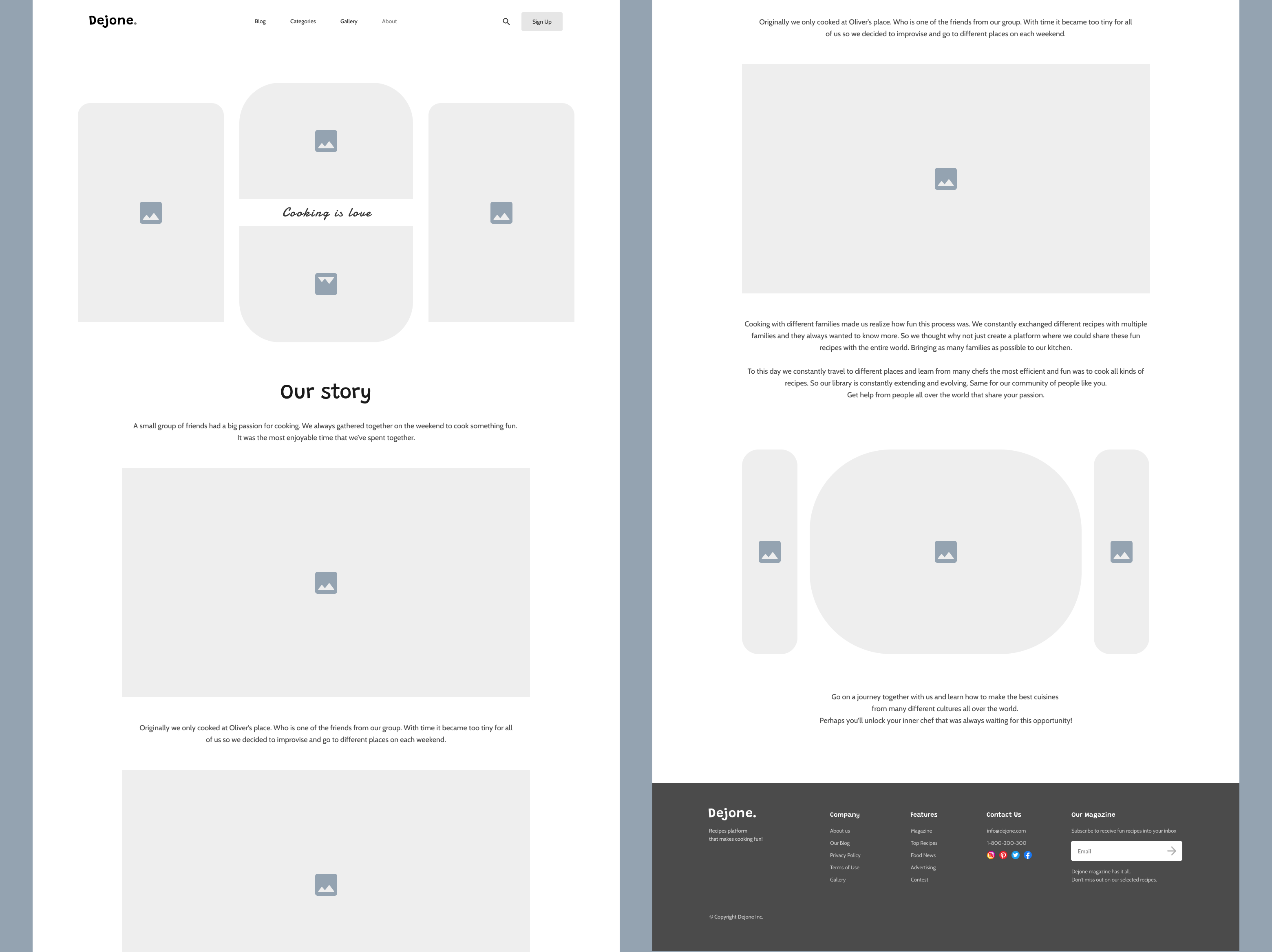
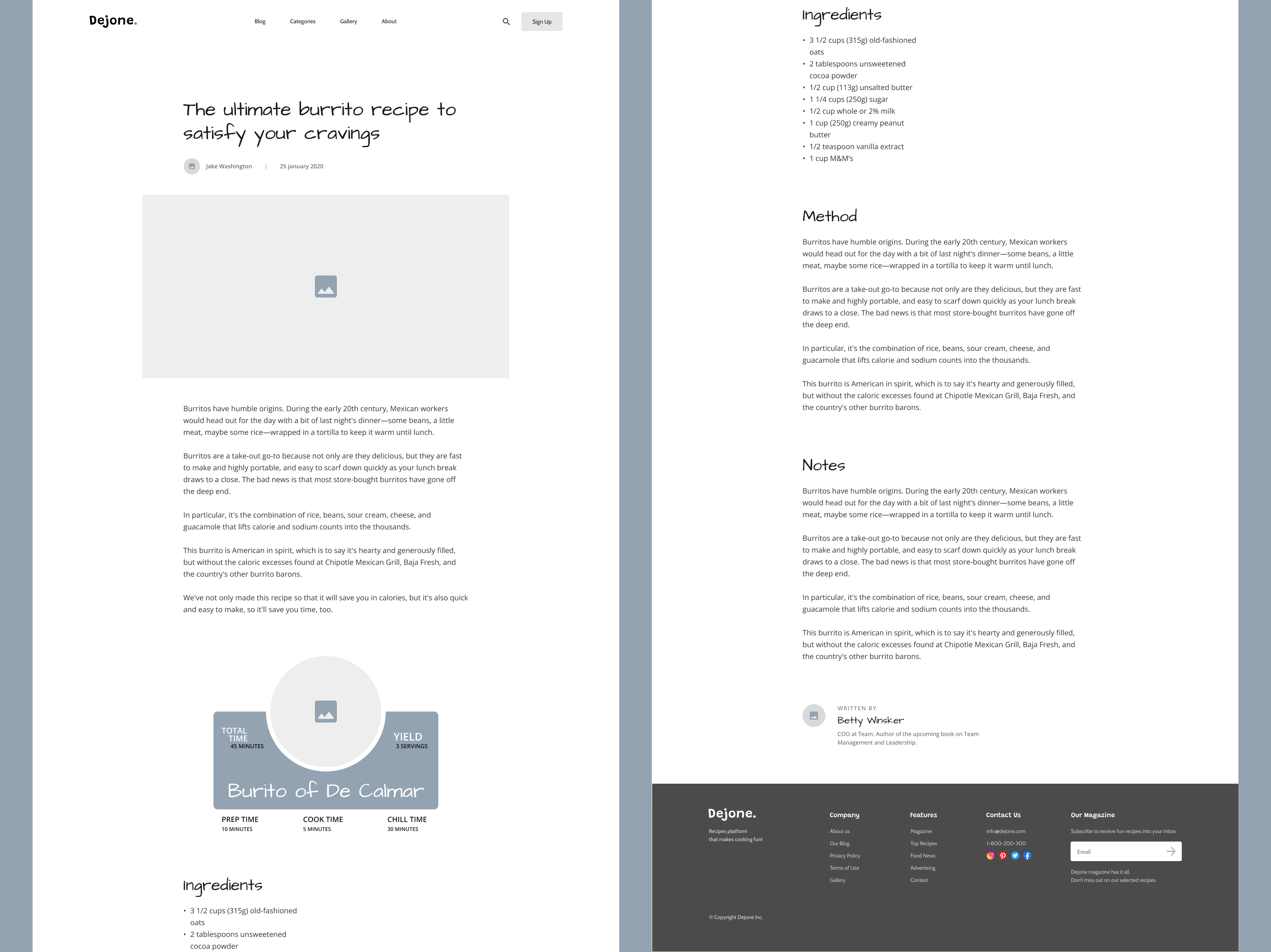
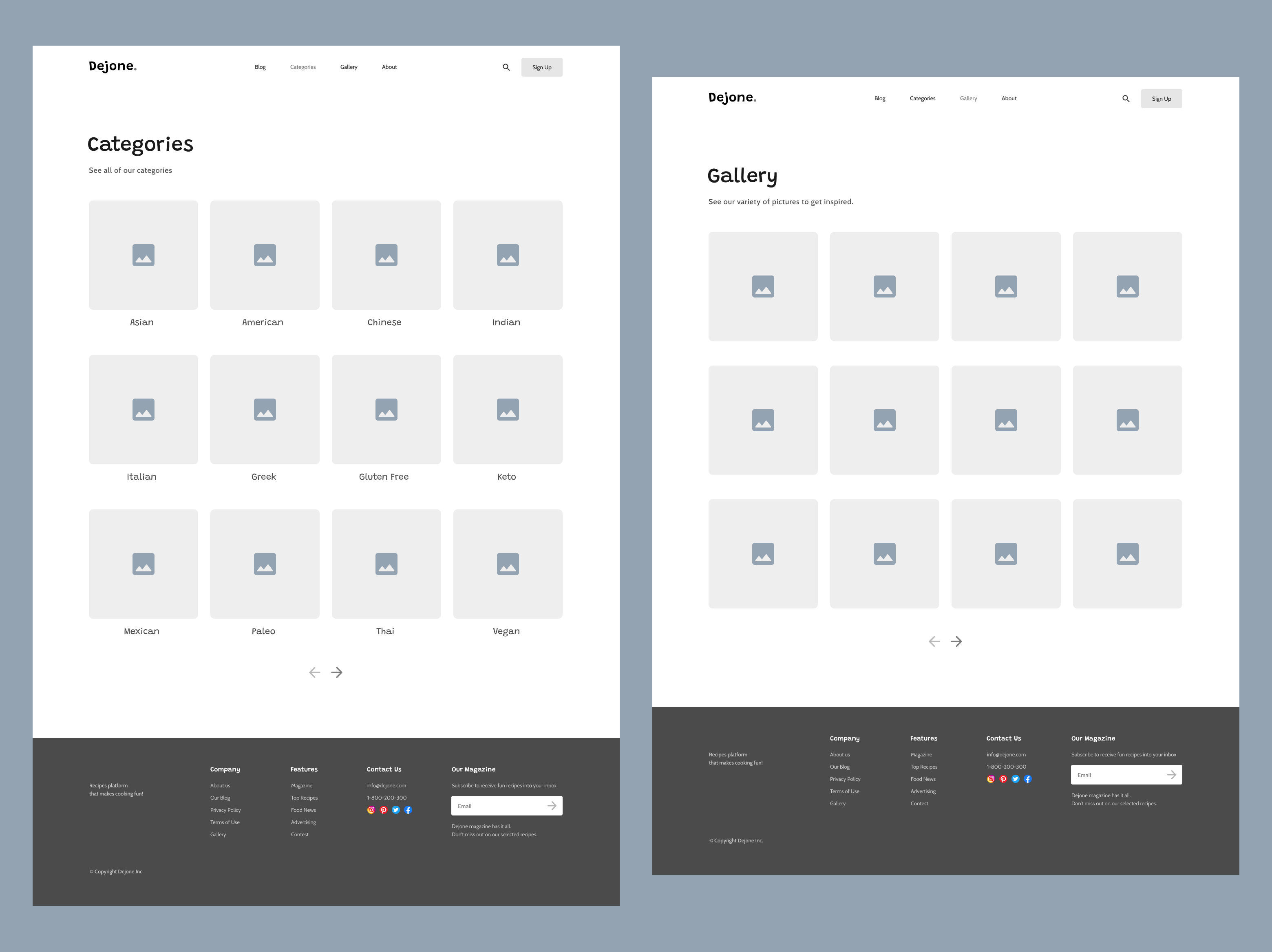
As part of the Dejone team, I was responsible for creating engaging and useful experiences within the Dejone website. Dejone has an enormous catalogue of recipes for each category that are uploaded by users, so to make the process engaging I made a like and dislike system that would place recipes at the top based on the amount of likes that they got. This has proven to make users more motivated to invest their time into making their recipes look professional. Like using high quality images and going more in detail on their recipes. Creating a dedicated search function and a homepage section for recent recipes was also proven beneficial. The search function got users to be more creative with the titles of their recipes. To drive engagement to them. And the section for recent recipes is being visited frequently. Dejone's dedicated blog gets a lot of traction because there's a dedicated section for blog posts on homepage as well. While understanding user behavior through analytics, I've learned that it would be most effective to create a homelike experience, where each page feels like a part of a cozy home. Below is a sample of the wireframes I created during the UX phase of the project.